Login/Register to keep track of your score.

#1 flex-3
#2 css-grid-2
#3 css-grid-1
#4 What is the default value of the grid-auto-flow property?
#5 Which of the following is an invalid property?
#6 What is the default value of the flex-wrap property?
#7 How to correctly place a grid item inside a named area?
#8 The align-self property apply to both flex items and grid items
#9 How to make all the grid rows equal in height?
#10 What is the default value of the flex-grow property?
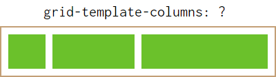
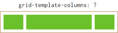
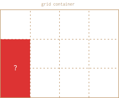
#11 How to define 3 columns in CSS grid?
#12 Which property cannot be used with negative values?
#13 css-grid-6
#14 How to make all the flex items in a single row equal in width?
#15 flex-flow is a shorthand for
Your Result
-
I am sure you will do better next time
